How Reel-Based Games Use Visual Storytelling, Animation, and Sound
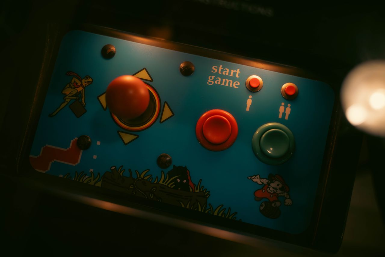
A game screen can establish a mood before a player presses a button. A few moving shapes, a recognizable soundtrack, and a carefully chosen palette may communicate the theme more quickly than a paragraph of instructions. That is one reason visual design matters across digital entertainment, from puzzle games and animated adventures to arcade-style interfaces built around rotating reels.
The language of those experiences often feels familiar to movie audiences. Film editors use rhythm to control attention. Production designers create worlds through color and props. Sound designers establish a sense of movement even when the camera barely changes position. Game creators work with many of the same materials, then face an additional question: how should the screen respond when someone interacts with it?
This article looks at the craft behind reel-based interfaces as a form of screen entertainment. It considers visual hierarchy, animation, interaction feedback, and accessible design rather than treating any particular application as representative of every game in the format.
From Film Frames to Interactive Screens
In a film, the next image arrives when the editor chooses it. In a game, the player's input may trigger a new state, a transition, or a short animation. Both experiences involve timing and visual communication, but the responsibilities differ. A movie needs its audience to understand what a scene means. An interactive screen must also show what can be selected and what happened after the selection.
Consider Mystery Team, the 2009 feature created by the Derrick Comedy group. Its humor relies in part on recognizable detective-story conventions: dramatic discoveries, apparently significant details, and the mismatch between the young detectives' confidence and their understanding of events. Those conventions help the audience interpret each scene. A digital game interface can likewise use familiar imagery to help someone recognize a theme, although that comparison is about design language, not about a direct connection between the film and a specific game.
This is a useful editorial bridge because game screens, like movie scenes, need visual priorities. If every element demands attention, the important information becomes harder to find. A good layout distinguishes the central activity from secondary controls, explanations, and decorative details.
What Makes a Reel-Based Interface Recognizable?
Many reel-style games use a grid or series of columns containing symbols that move through a short animated sequence. The format is visually distinct even before the player learns an individual title's rules. Repeated shapes establish a pattern, while changes in movement or alignment make different moments recognizable.
This familiarity gives designers a starting point. A player can identify the main display without searching through several unrelated panels. The challenge is avoiding a screen so ornate that controls become difficult to see. The decorative theme and the practical interface need to cooperate rather than compete.
There are several ways developers approach that balance. Some favor clean, flat icons and short transitions. Others build elaborate scenes around illustrated characters, mechanical motifs, or cinematic effects. Neither style guarantees clarity. The better test is whether a person can tell what is interactive, what is informational, and what is simply part of the atmosphere.
A useful comparison is a movie poster. It can carry a large amount of visual personality, but its title and main subject still need to be legible. A reel-game screen also benefits from a recognizable focal point, clear typography, and restrained supporting details.
Symbols, Themes, and Visual Identity
Symbols are the vocabulary of a reel-based interface. Their outlines, colors, and spacing affect how quickly they can be recognized. When icons share a coherent illustration style, a screen can feel unified even if the symbols represent very different objects.
A retro design might borrow visual cues from mechanical displays, glowing bulbs, or early arcade cabinets. A fantasy theme might use illustrated landscapes, ornate borders, and character portraits. A science-fiction design could favor geometric symbols and sharply differentiated panels. These are creative choices rather than claims about the underlying rules of a game.
The role of contrast
Contrast does more than make a screen attractive. It separates meaningful information from background decoration. When two icons have similar silhouettes and colors, players may need more time to distinguish them. A designer can respond by changing shape, labels, border treatments, or positioning rather than relying on color alone.
The W3C's Web Content Accessibility Guidelines recommend that information not depend only on sensory characteristics such as shape, color, or position. In practice, that means instructions should remain understandable when a person cannot easily perceive one particular visual cue. See the WCAG 2.2 recommendation for the broader accessibility framework.
Familiar themes without visual clutter
Decorative details work best when they support the main interaction. A textured frame or subtle background can establish personality, but constant moving particles may compete with the interface itself. Designers should ask whether a detail improves recognition, reinforces a theme, or simply adds noise.
This question is especially important on smaller screens, where space is limited and a decorative element may crowd out useful labels.
Animation Is a Form of Feedback
Movement can explain that an action has started, that the screen has changed state, or that an interaction has ended. In reel-based game experiences, the animated sequence often becomes the most noticeable part of the interface. Its practical design challenge is communicating progression without making the screen unnecessarily difficult to read.
Animation can also make transitions feel connected. A sudden unexplained screen change may leave someone unsure whether the system received an input. A short, consistent transition can provide a sense of continuity. Designers must still ensure that motion does not hide essential controls or delay actions without a clear reason.
Timing matters. An effect that feels exciting during the first interaction may become repetitive when it appears over and over. Clear visual feedback should be prompt enough that the person understands what happened. Optional effects should be adjustable where possible, particularly when motion is not essential to interpreting the interface.
The W3C's guidance on animation from interactions explains why motion sensitivity deserves attention. This is a general interface-design principle, not a rule about any one genre.
Sound Design and the Feeling of Progress
Sound adds another layer of structure. A short effect can accompany a button press. A subtle change in music can announce a shift in the interface. A repeating rhythm can make a sequence feel coherent rather than like a series of disconnected screens.
The best use of sound is usually informative as well as atmospheric. If an audio cue marks a state change, the interface should also provide a visible indication. Someone playing in a quiet setting, using a muted device, or relying on assistive technology should not be excluded from understanding the interaction.
Film offers a useful comparison here. A mystery soundtrack may build anticipation around an ordinary-looking object. A comedy may use a pause or an abrupt sound to change the audience's interpretation of a moment. Games adapt such techniques to responsive environments, where the next cue may depend on an action rather than a fixed edit.
Sound also benefits from restraint. Overlapping signals can make basic interactions harder to distinguish. A consistent vocabulary of short cues is often easier to learn than a large collection of unrelated effects.
Mobile Layout Changes the Design Problem
Designing for a desktop display is not the same as designing for a phone held in one hand. A wide interface may accommodate a separate navigation panel, a large central display, and supporting information. On a narrow screen, these elements must compete for a much smaller area.
A mobile layout therefore needs a strong information hierarchy. The core interaction should remain visible, controls should be easy to distinguish, and secondary details should not obscure the main screen. Typography also has to survive scaling: small decorative labels that look elegant on a monitor may become almost unreadable on a phone.
Roblox's UI and UX design documentation describes prioritization, visual language, consistency, and understanding player needs as foundational design ideas. Although that guidance is written for a particular game-creation ecosystem, its broad principles apply to many interactive interfaces.
Responsive design is more than shrinking every element. Sometimes a layout requires different spacing, simplified controls, or a reorganized information panel. The goal is to preserve the meaning of the interface while adapting its presentation to the device.
When Visual Effects Get in the Way
An elaborate interface may look memorable in a promotional screenshot but feel exhausting during repeated use. Designers should evaluate the whole experience, including waiting, navigation, settings, text readability, and the ability to understand the current state.
One practical review method is to temporarily remove the decorative artwork. Can a person still recognize the controls and follow the sequence? If not, the visual structure may depend too heavily on style. A second review can add the theme back and check whether it supports rather than hides the essential information.
Another useful check involves consistency. Buttons with the same function should behave in familiar ways. Labels should not change meaning from one screen to another. Repeated navigation should appear in predictable places. These conventions reduce the amount of relearning required between interactions.
The W3C discusses such predictability in its consistent navigation guidance. The principle applies to websites and helps explain why an interactive product should avoid unnecessary surprises in its basic controls.
Screen Entertainment as a Design Discipline
Reel-based interfaces sit within a wider history of visual entertainment that includes animated displays, arcade cabinets, mobile games, and cinematic presentation. Their appearance can be studied through the same practical questions asked of other screen-based experiences: What attracts attention? Which signals communicate action? How does a theme remain recognizable? What helps someone understand the interface on a small display?
A strong design provides answers through layout, animation, sound, and consistent feedback. The resemblance to film storytelling is meaningful at the level of presentation, not because games and movies share identical mechanics.
That distinction makes the comparison useful. Filmmaking offers lessons in pacing, visual identity, and atmosphere. Interactive entertainment adds the need for responsiveness, clarity, and player control. Understanding both sides makes it easier to appreciate the craft behind a memorable digital game screen.
Featured image: illustrative stock photography by James Collington / Pexels (photo source) · Pexels License. Not an original Mystery Team production photograph.